JavaScript is disabled
Our website requires JavaScript to function properly. For a better experience, please enable JavaScript in your browser settings before proceeding.
With modern high resolution monitors we have much more 'real estate' on our screens than we once did, and responsive styling allows us to customize the view for various screen resolutions. I'd like to get opinions on the fixed width design (which we currently use) versus the wide format (which we may decide to adopt in the future).

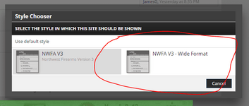
To check out the wide format just scroll to the very bottom of the page, click NWFA V3 (it's in the middle, very light gray), and click NWFA V3 - Wide Format. Repeat these steps to switch back to the default format.

Edit: I forgot to mention, this change would only apply to devices with a viewport size above 1280px wide. You can check your viewport size here.
 
I am not noticing any difference in the two. Could it be that my computer is not allowing the change? Let me restart my computer and try it again. Shut down and restarted it and the only difference I can tell is there is more room on the sides of the screen on the wide screen version.
 
Last Edited:
I am not noticing any difference in the two. Could it be that my computer is not allowing the change? Let me restart my computer and try it again. Shut down and restarted it and the only difference I can tell is there is more room on the left side of the screen on the wide screen version.

I forgot to mention, this change would only apply to devices with a viewport size above 1280px wide.

You can check your viewport size here: http://viewportsizes.com/mine/
 
Ooh ooh, I like what I'm seeing right now. I had my screen set up so I had to scroll right about .5" to see everything though.. no scrolling now.
I have a feeling though that if someone posted a huge honking picture here right now, it'd wonk up the whole thread.
 
Wouldn't viewport size be irrelevant given the users resolution/font size? I think it would be contradicting.

The viewport is based on screen resolution AFAIK. Not sure how font size affects things, but I'll make a note to check it.

Ooh ooh, I like what I'm seeing right now. I had my screen set up so I had to scroll right about .5" to see everything though.. no scrolling now.

Good to hear. What's your viewport size?
 
The viewport is based on screen resolution AFAIK. Not sure how font size affects things, but I'll make a note to check it.


Good to hear. What's your viewport size?
I'll have to check/figure that out.. I'll let you know.
Oh, it's 911x511.. not as painful to do as I thought.. given the given link!
 
It's of no use for PC. The viewport sizes are for smartphone only.
When I scroll to the bottom, again for PC, there's no option at the bottom for NWFA V3

To check out the wide format just scroll to the very bottom of the page, click NWFA V3 (it's in the middle, very light gray), and click NWFA V3 - Wide Format.

One key point, Joe, is that you forgot to mention the V3 Wide Format options are found in the user preferences...lol. I found it....eventually :rolleyes:
 
Last Edited:
It's of no use for PC. The viewport sizes are for smartphone only.
When I scroll to the bottom, again for PC, there's no option at the bottom for NWFA V3


One key point, Joe, is that you forgot to mention the V3 Wide Format options are found in the user preferences...lol. I found it....eventually :rolleyes:

I may be incorrectly interchanging viewport and resolution, likely because the viewport meta tag (which applies to and affects desktop, tablet, and mobile). It's all one responsive design rather than a device specific style, so everything is interconnected. This is especially relevant when considering users with low res desktops (~1024px) are going to see the site the same way it displays on many tablets.

Here are the V3 options at the bottom. I didn't mention the options in the user preferences since this is more convenient ;)

v3_wide_1.PNG

v3_wide_2.PNG
 
It is worse.

My viewport size is 1362 × 674

The layout for the content narrows instead of getting wider to take advantage of the wider screen real estate.

This is possibly because I use a font size of 110% or more in my browser.

This is one of my pet peeves with website layouts; most do not take advantage of larger screen resolutions and do not properly layout at enlarged font sizes. I know from experience this is somewhat difficult to do having laid out HTML myself, but it can be done. It has been a while (I mostly write desktop apps, not websites), but if I remember right, one of the things is to use relative sizes for HTML elements and not fixed sized elements.
 
My viewport size is 1652, but I really can't say I see much difference. I tried it at home, with a similar viewport size and all I got was a widening of the grey bars on the sides of the screen. The content areas appeared unaffected.
 
I like a wide version but then I'm weird. Kind of like when somebody records video on their phones and it's vertical not horizontal.... just rotate the camera people!!!
 

Upcoming Events

Lakeview Spring Gun Show
Lakeview, OR
Albany Gun Show
Albany, OR
Falcon Gun Show - Classic Gun & Knife Show
Stanwood, WA
Wes Knodel Gun & Knife Show - Albany
Albany, OR

New Resource Reviews

Back Top