Navigation
Install the NWFA app
How to install the app on iOS
Follow along with the video below to see how to install our site as a web app on your home screen.
Note: This feature may not be available in some browsers.
More Options
You are using an outdated browser
The browser you are using is likely incompatible with our website. We recommend upgrading your current browser or installing an alternative.
JavaScript is disabled
Our website requires JavaScript to function properly. For a better experience, please enable JavaScript in your browser settings before proceeding.
-
Join the #1 community for gun owners of the Northwest
We believe the 2nd Amendment is best defended through grass-roots organization, education, and advocacy centered around individual gun owners. It is our mission to encourage, organize, and support these efforts throughout Oregon, Washington, Idaho, Montana, and Wyoming.Free Membership Benefits
- Fewer banner ads
- Buy, sell, and trade in our classified section
- Discuss firearms and all aspects of firearm ownership
- Join others in organizing against anti-gun legislation
- Find nearby gun shops, ranges, training, and other resources
- Discover free outdoor shooting areas
- Stay up to date on firearm-related events
- Share photos and video with other members
- ...and much more!
Feedback Request Northwest Firearms Version 3 beta now available for Supporting Members, Vendors, and Volunteers
- Thread Starter Joe Link
- Start date
- Status
-
Not open for further replies
- Messages
- 1,686
- Reactions
- 1,276
Staff Member
Diamond Supporter
Platinum Supporter
Bronze Supporter
- Messages
- 12,559
- Reactions
- 18,018
- Thread Starter
- #23
New is always a tough one for me, my problem though and I'll get used to it as I have before.
It'll make me nuts though if I can't see a preview of a thread when I hover over the title!
Thank you.
I'm hoping the adjustment is quick and painless. Let me know if there's anything we might do to ease the transition.
Regarding the thread previews, we're definitely going to maintain them. It looks like members are split 50/50 on whether they like them or not, so we've put a lot of effort into developing a user-selectable option for them.
Overall look is nice, clean. But two things are tucked away that I prefer more out in the open:
1. The alerts - now instead of hovering to see what I have in my inbox or replies/likes, I've got to click once, choose Alerts or Message Center, then click again to see what it is. 2 extra steps. I'd like to see something that would work similar to the current version. EDIT - I just noticed I missed your response to Taku about this - disregard.
2. Same goes for "New Content" (New Posts) - I use this feature pretty much all the time - and it was nice having it easily accessible right at the top of the page. But now it's tucked away too. I'd like to see that out in the open as well.
3. And +1 to getting the hover 'preview' of a post - I use that a lot too and noticed that was also missing.
I know you're going for a compact header style, but I don't know if I like seeing commonly used features/controls buried.
1. What I was mentioning to Taku was in reference to the notice bubbles, but I think in my sleep-deprived state I completely missed what he was saying. I understand now, it's not the notification that you have something there, but the steps needed to quickly view and access the alerts/messages. I've noted this.
2. Noted.
3. See above
I agree with you, common features need to be convenient. I tried to get feedback before we started to gauge which people used most and which they didn't, but I didn't have much luck. I'm certain once users can't find what they need that I'll have no lack of input
On mobile, where is the watched threads tab?
It's now under User Menu -> Account Settings -> Watched Threads. This is another I'll add to the list of things people likely use frequently.
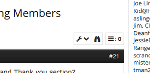
Why is the text at the bottom in Spanish, about NW Firearms and Thank you section?
That's what's referred to as Lorem Ipsum text, used for design work. It allows us to better focus on design aspects, rather than actual content, during development.
More here: https://en.wikipedia.org/wiki/Lorem_ipsum
Staff Member
Diamond Supporter
Platinum Supporter
Bronze Supporter
- Messages
- 12,559
- Reactions
- 18,018
- Thread Starter
- #24
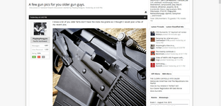
Seems like the margins are different - more real estate being used up on the right column, and squeezing the actual 'main content' in the middle:
That's correct, the 'main content' box was reduced by 50 pixels, which is about the width of your thumbnail above (and likely the one on your hand too
 ). Doing this allows us to put more useful content in the sidebar (such as real-time NRA and OFF alerts). The margins will probably stay like this, but we're still working on them.
Platinum Lifetime
Silver Lifetime
- Messages
- 1,175
- Reactions
- 1,754
I really appreciate all the effort Joe! While the content is the star here, the environment is make or break on how or if it gets used. Very nice!
- Messages
- 370
- Reactions
- 299
Looks great Joe.
Staff Member
Bronze Supporter
- Messages
- 4,220
- Reactions
- 5,055
Joe, update on the page view alignment after following an email notification link; same problem on mobile too.
Staff Member
Diamond Supporter
Platinum Supporter
Bronze Supporter
- Messages
- 12,559
- Reactions
- 18,018
- Thread Starter
- #28
Seems like the margins are different - more real estate being used up on the right column, and squeezing the actual 'main content' in the middle:
Quick update on this, looks like I just found a simple way to take the difference between versions from 58px to 29px (regained almost 50%). I'll work on implementing that as soon as possible, then figuring out where I can come up with the remaining 29px.
Joe, update on the page view alignment after following an email notification link; same problem on mobile too.
Thanks! Which type of email notification is it? Can you post a screenshot of the issue?
Quick update on this, looks like I just found a simple way to take the difference between versions from 58px to 29px (regained almost 50%). I'll work on implementing that as soon as possible, then figuring out where I can come up with the remaining 29px.
Thanks! Which type of email notification is it? Can you post a screenshot of the issue?
@Joe Link
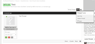
I'm trying to lock a thread - that control is missing from the thread tools whether on a tablet or a computer.
Staff Member
Diamond Supporter
Platinum Supporter
Bronze Supporter
- Messages
- 12,559
- Reactions
- 18,018
Staff Member
Diamond Supporter
Platinum Supporter
Bronze Supporter
- Messages
- 12,559
- Reactions
- 18,018
- Thread Starter
- #32
Where is the "New Posts" on vs 3.0
It's in the Menu at the top left, second item.
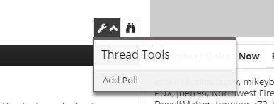
@etrain16 do you see this wrench icon with the down arrow? If so, can you check in there?
View attachment 242514
Yes, I do. The only thing in there is "add poll":

Staff Member
Diamond Supporter
Platinum Supporter
Bronze Supporter
- Messages
- 12,559
- Reactions
- 18,018
- Thread Starter
- #34
No, Off Topic. Is that not an option that's available outside the classifieds? I've not tried it before.
Staff Member
Diamond Supporter
Platinum Supporter
Bronze Supporter
- Messages
- 12,559
- Reactions
- 18,018
- Thread Starter
- #36
No, Off Topic. Is that not an option that's available outside the classifieds? I've not tried it before.
Yeah, you can only lock your own threads within the classified section
Yeah, you can only lock your own threads within the classified section
I did not know that, but I do now. And knowing is half the battle.
Staff Member
Diamond Supporter
Platinum Supporter
Bronze Supporter
- Messages
- 12,559
- Reactions
- 18,018
- Thread Starter
- #38
Man I miss being a kid!
- Messages
- 3,380
- Reactions
- 4,737
Lorem Ipsum also helps you see more quickly what text hasn't been worked on yet.
Even though a part of me dislikes ads, I really like how you have built in a lot more ad space without it being too overwhelming. If we want this site to stick around, it really needs to remain monetized! I support the ad space.
Something recent you just added that I like and hope remains in the new version is how alerts actually populate into the teeny little NF icons in my browser. So now, it actually shows with a teeny little number whether or not I have alerts right there on my bookmark menu. Very cool!
- Messages
- 3,380
- Reactions
- 4,737
Hey, I just started a thread in a discussion forum and noticed a typo in my title. I clicked on the little wrench icon and was VERY surprised to see the option to Edit Title. I know you changed that recently to help with outside searches or something above my head. Do you need to remove that option, or is there a time limit? Just wondering if that is a new feature or a bug.
- Status
-
Not open for further replies
Share This Discussion
Similar threads
- Replies
- 9
- Views
- 1K
- Replies
- 28
- Views
- 3K
Upcoming Events
New Classified Ads
-
AC Unity 40 round mags for HK MP5 and clones
- Started by Fuji
- Replies: 0
-
-
-
-
Leupold Mark 5HD 3.6-18x44 M5C3 FFP - Illuminated PR1-MIL #180725
- Started by clownbuster
- Replies: 0
-
-
-
-
-
Dillon CV2001 | Vibratory Case Cleaner
- Started by Blackhammer
- Replies: 0
Support Our Community
If our Supporting Vendors don't have what you're looking for, use these links before making a purchase and we will receive a small percentage of the sale


